Đọc phiên bản tiếng Việt tại đây.
You were trained at the School of Architecture at the Politecnico of Milan (Italy). How did you pivot to exhibition design, and has your background in architecture informed your experience as a spatial designer in any way?
My education led me from architecture to exhibition design. For an architect, exhibition design is especially satisfying because it allows you to see a project come to completion much more quickly. It is a form of ephemeral architecture, and I was immediately attracted to its creative possibilities. In Italy, especially when I was studying, there was never a separation between architecture, product design, and interior design.
My first project with GSM Studios was in 2004, when I had already begun practising exhibition design in Singapore. It was the Living Galleries for the National Museum of Singapore (NMS). At that time, GSM Studios (formerly GSM Project), a Canadian company, did not yet have an office in Singapore. I suppose I was one of the few exhibition designers in Singapore beginning to produce small exhibitions independently. GSM Studios had just been appointed to the Living Galleries project, which was a very large commission. They entrusted me with a portion of the exhibition – the four galleries dedicated to photography, food, film and fashion. It was also my first opportunity to work on a permanent exhibition of that scale.
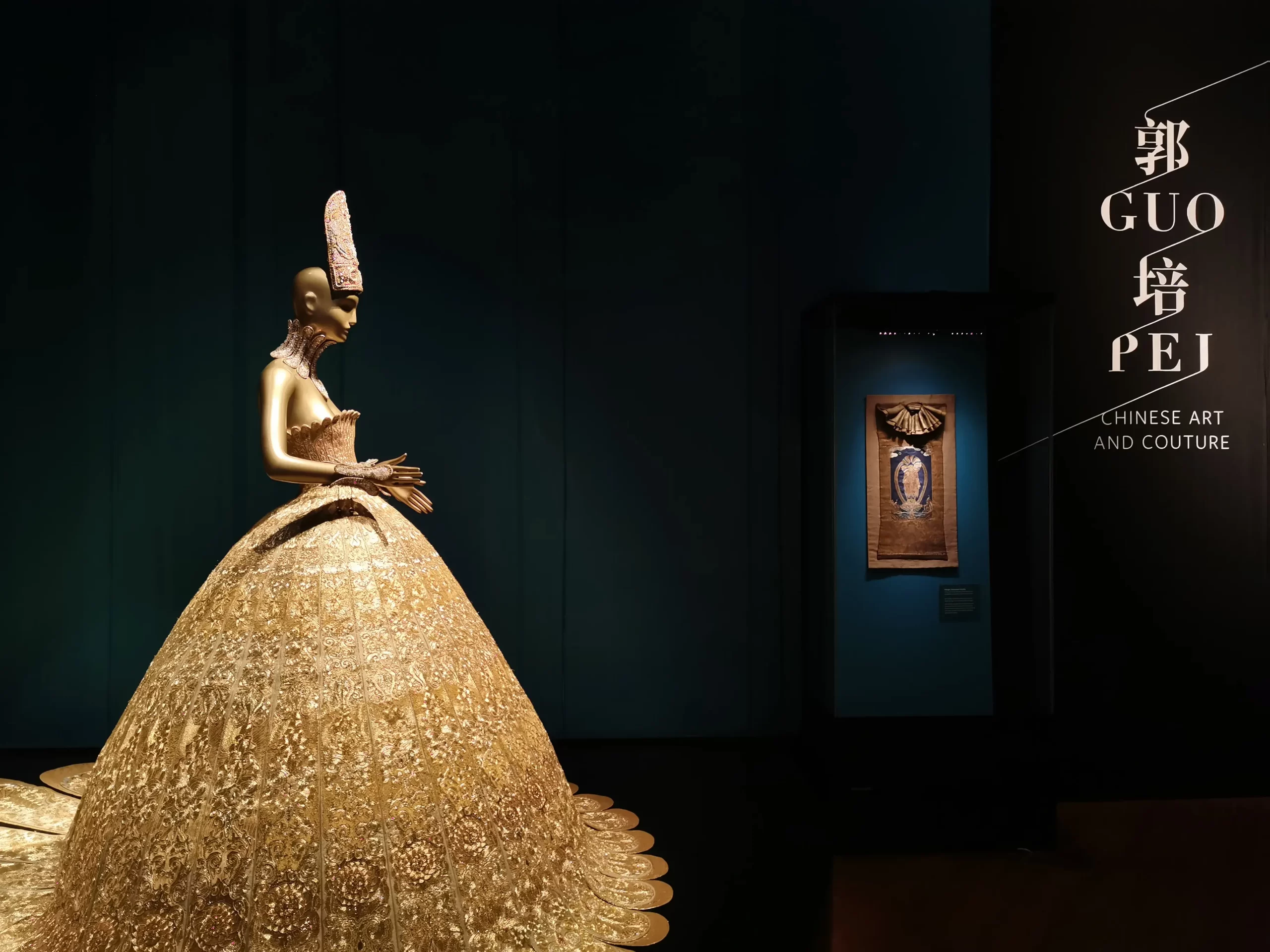
The scene must have been quite different then. What did you and GSM Studios emphasise at the time to create a good spatial experience for visitors?
Looking back at my early experiences as an exhibition designer in Singapore, even before joining GSM Studios, one of the biggest concerns was raising exhibition standards in terms of construction quality, execution and orchestration. The industry, as you know it today, simply did not exist. The ecosystem of specialised exhibition fabricators, who are familiar with exhibition graphics, showcases and museum production, had yet to develop. One of the biggest struggles was therefore establishing collaborations for making exhibitions when Singapore’s museum industry was undergoing profound change.
Another major concern was changing how exhibitions were curated, and stories were told. At that time, the NMS was still a rather old-fashioned institution, and many curators were not accustomed to working in a more contemporary way. GSM Studios proposed telling stories differently through new media and more engaging forms of interpretation. With the main History Gallery at NMS, for instance, an audio companion was introduced, eliminating text altogether. Stories were told entirely through sound. GSM Studios was fascinated by the idea of oral history and assembled an entirely new team that included actors voicing scripts written not only by curators but also by writers in the style of radio drama. The ambition was to approach history in a more innovative way that could capture younger audiences, rather than relying on the traditional model of objects accompanied by text.
Since the early 2000s, the expectations for museum-goers have evolved with the advent of social media, mobile entertainment, and omnichannel designs. How has the role of texts evolved in complementing the exhibits?
Right now, there is such a wide range of solutions. What has changed and become incredibly sophisticated is the way graphic designers work within exhibitions, approaching text in space in ways that can be layered and visually stimulating. We often ask, “How short can a text be?” But the issue is not simply length. It is about layering information and working with curators so those layers are meaningfully articulated in space. Exhibition texts operate at different levels within an exhibition. Some provide overarching context for a gallery or thematic section, while others relate directly to individual objects, guiding visitor behaviour, provoking reflection through quotations, or offering opportunities for deeper engagement. Not everything is determined entirely by the designer, as even the same text element may be used differently by different visitors in different situations. For example, a solitary visitor experiences these textual layers differently from a guided group, where text supports collective interpretation rather than individual contemplation.
In recent times, I see the overwhelming presence of QR codes and phones. Exhibition spaces are populated by them, similar to what is happening in our commercial spaces. The way they are presented in terms of design can be very crude. Even QR codes can be redesigned, but oftentimes they are not. These details are often treated simply as practical additions.
Beyond that, it is really about the use of mobile phones. While the audio companion experiment with NMS was extremely successful, it received strong criticism because it imposed a kind of visiting experience that relied solely on headsets and deprived visitors much socialisation during the exhibition. While mobile phones could be interesting, I think exhibitions could be a privileged space where we enjoy the spatial dimension more than the screen dimension.
What is one recurring challenge when working with texts alongside exhibits?
At the NMS, we considered presenting text in four languages because of Singapore’s language policy. The idea itself is attractive and well-intentioned, but when you multiply text by four, there is an issue with space.
Text takes space, especially when it is written in a way that is legible. It also has to deal with the dwelling time of a visitor and their capacity to absorb information in space without getting stuck reading a wall of text. Maybe you can think of exhibitions as movement, which is very different from a book that you read while sitting. A classic sentence we always say as exhibition designers is to avoid creating “a book on the wall.”
That said, I actually love text graphics. Throughout my trajectory in exhibition design, I have worked with amazing graphic designers who changed my understanding of words in space. They have a refined way of thinking about negative and positive space, both mentally and visually.
I think it is amazing that graphic design for exhibitions is very different from designing books or printed material. It is the ability to visualise text in space, using scale in a visual rather than mechanical way to think across different architectural contexts. Text needs to respond to the scale of the space and the artefacts. Because text has legibility rules, we tend to follow certain design principles that make it bigger and easier to read. However, it has to work within a context where the artefacts remain the protagonists. In that sense, text should serve in a secondary role.
While texts can be useful as didactic material that guide one’s gallery experience. Could you share an example of how you decide what text to omit or prioritise?
As mentioned, the NMS was an example of removing text entirely. A different example is the Lee Kong Chian Natural History Museum at NUS. As a university museum, it had to present scientifically rigorous content while remaining accessible to non-specialists. One challenge was persuading experts, who were mostly biologists, that there could be other ways of looking at living and natural specimens besides only through their disciplinary silos. There could also be ways of weaving stories.
That was a very complex discussion at the beginning. This phase of design is what we generally call the interpretive plan – a major effort in deciding how content should be articulated within the space.
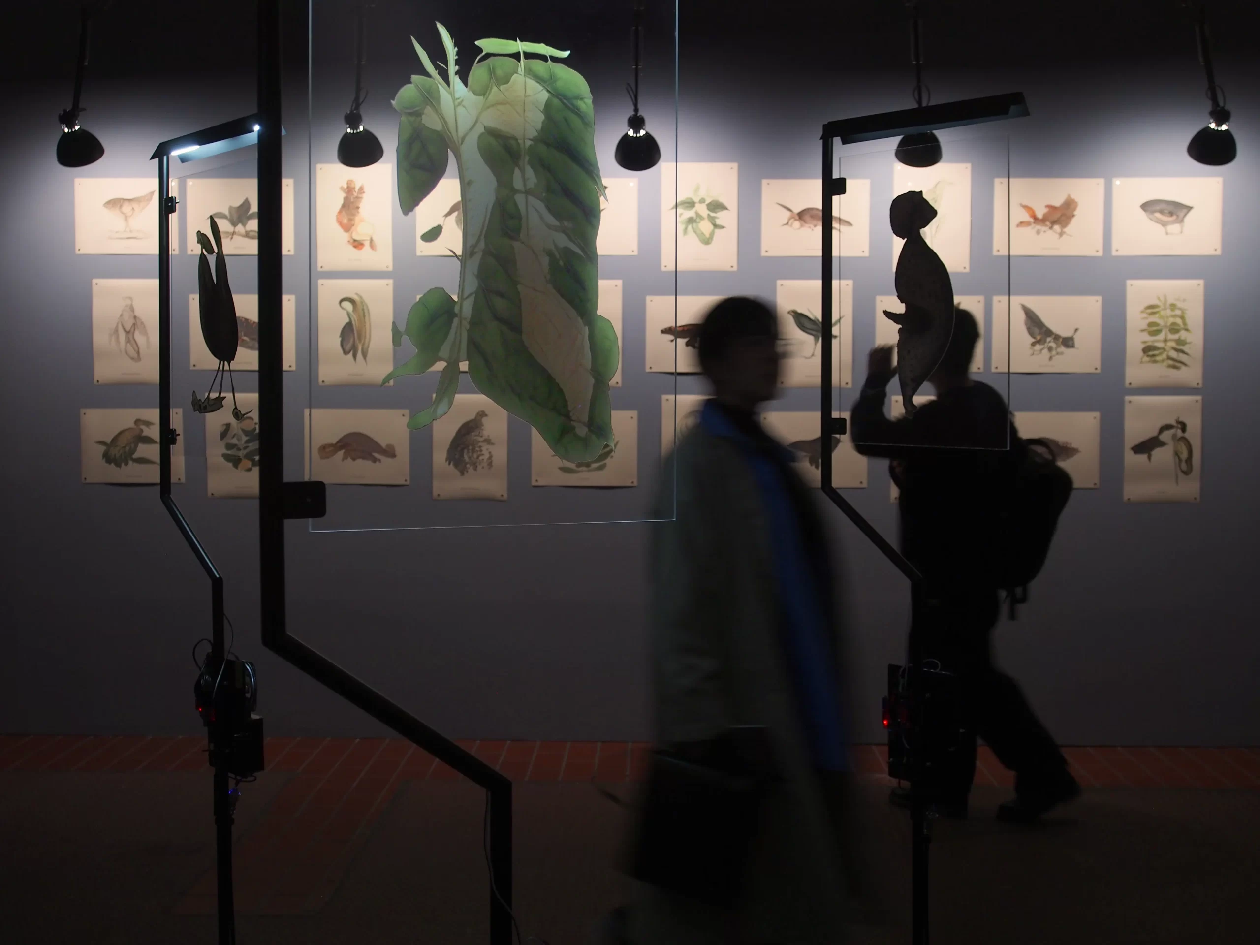
The exhibition was eventually organised through different parallel narratives. Some discuss biodiversity with scientific terminology, while others focus on how plants or animals use amazing strategies to survive. These stories allow visitors, especially younger audiences, to connect much more easily with the specimens on display. We therefore articulated different layers of text for different purposes. Each zone opens with three anchoring questions: What? Where? When? For instance, what are arthropods, where they live, and when they first appeared on Earth? These simple questions provide an immediate anchor that allows educators to guide visitors through the exhibition.
What are your thoughts on the sonic dimension of text, especially given your practice with SISTRUM, an inter-disciplinary collective focussing on sound and installation art?
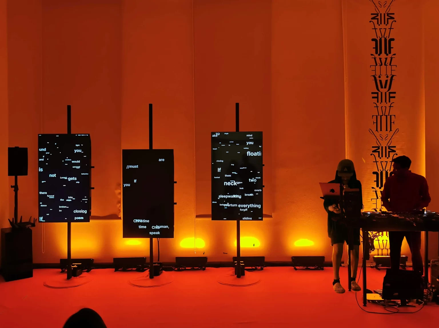
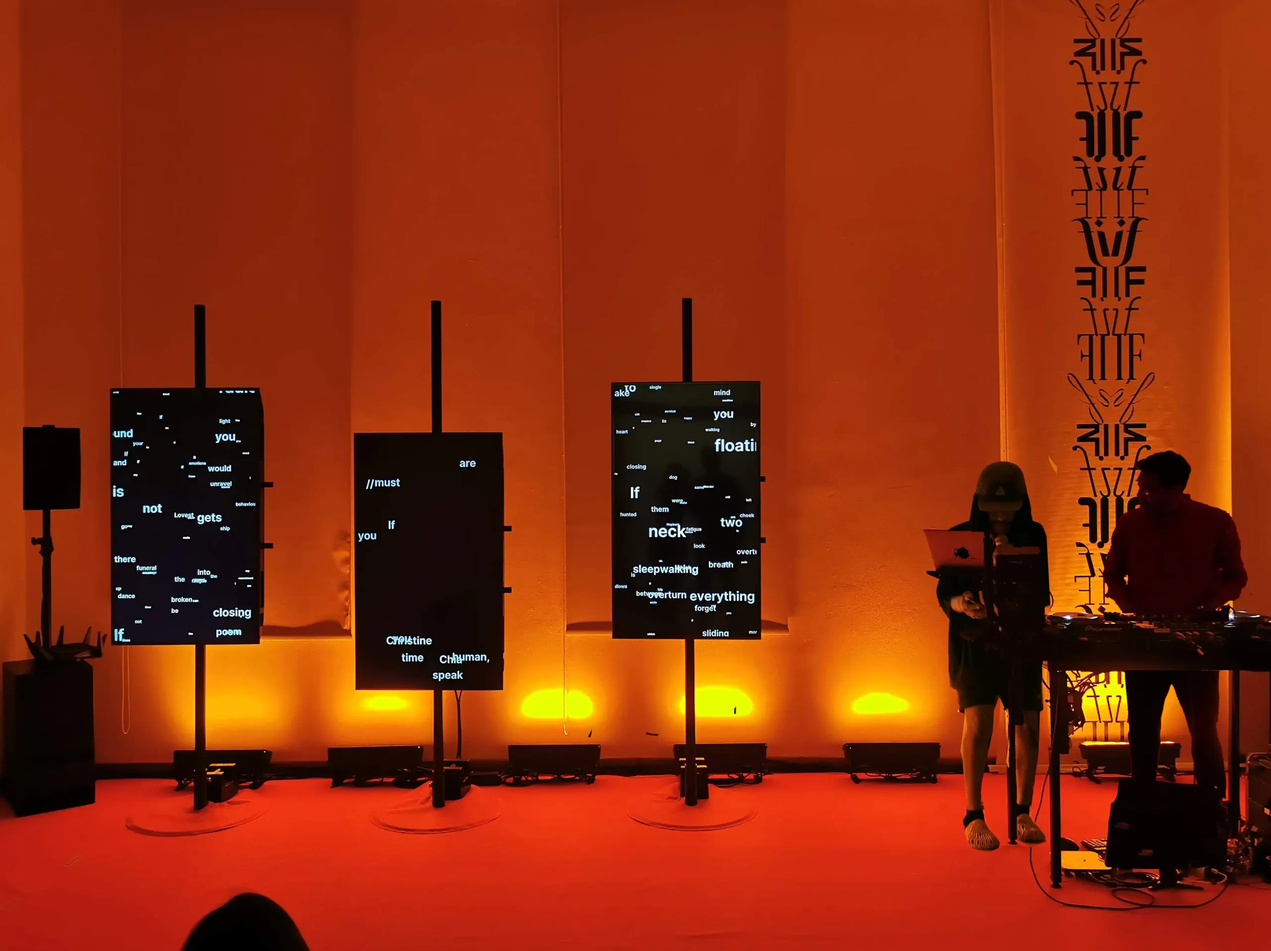
SISTRUM is a collective comprising sound designer Ramesh Krishnan, graphic designer Lim Shumin and myself as an architect. We collaborated many times with writers because all three of us share a love for text and the written word. At the Singapore Writers Festival, for instance, we created an experiential room for the edition, titled If We Pause in Mid Thoughts. Inside the room are screens in which Shumin programmed text that was partly fed by visitors and partly machine-generated. Visitors could contribute additional sentences to form poetic responses. The text also responded to sound because the room was designed to host readings, live DJ and music. The idea was to bring together the fabric of poetry, speech, rhythm, and music, while simultaneously using media to integrate words visually and dynamically, unlike the usual static role of text in exhibitions.
Those are quite boundary-pushing experiments. How can we bring that same sense of wonder to diverse-abled visitors? When designing text for accessibility needs, what factors are most critical?
Exhibition spaces have the unique ability to move beyond our vision-centred everyday world by engaging sound, touch and even smell. I would return to the Living Galleries, my first project with GSM, because it allowed me to experiment with multisensory exhibition design.
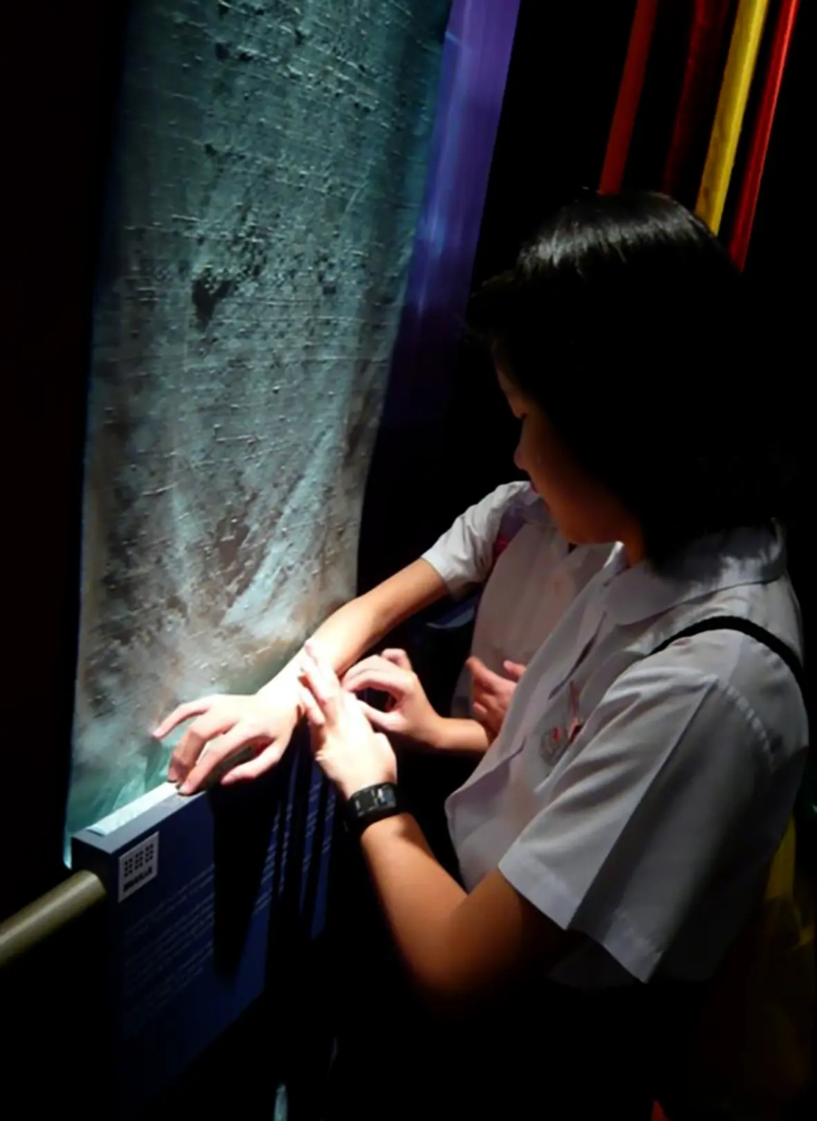
About a year after the exhibition opened, I was approached by the Singapore Association of the Visually Handicapped. They wanted young visitors with visual disabilities to navigate the galleries more independently rather than relying on guides or companions. Because the exhibition already incorporated rich sensory stimuli, they felt it provided a good foundation for accessibility. As I had little expertise in this area and there was limited literature available, I worked directly with visually impaired children to understand how they navigated space and experienced exhibitions.
The challenge of accessibility is recognising that people with different abilities also possess different strengths. Rather than designing for a single user, I believe a genuinely multisensory approach can accommodate many forms of experience, much like the natural world, which engages us through a richness of sensory stimuli that exhibitions should strive to recreate.
Words: Weiqin
Translation: Art Nation