Đọc phiên bản tiếng Việt tại đây.
Before learning to write, almost every Vietnamese child knows by heart the rhyme “O, round as a hen’s egg”. Born out of the literacy campaigns of Binh dan hoc vu (Popular Education movement), this simple phrase has remained in collective memory as a first lesson in letterforms. The rhyme perfectly encapsulates the relationship between word and image: to look at an egg is to see the letter O on a page; to write an O is to picture the egg. The letterform appears at once as a standard and as something utterly ordinary.
This brings us to the story of letterforms in propaganda posters. For years, discussions of this genre have treated the image as the protagonist, giving it the greatest attention while relegating lettering to a mere supporting role. This article aims to reverse that dynamic: by lingering on the letters, it uncovers their specific history and distinct visual politics.
THE PRIMER STROKE
When analysing writing as an element of art, three concepts commonly come into play: typography, lettering and calligraphy. Typography is the art of selecting, arranging and formatting type within a composition, and is commonly associated with graphic design. Lettering is the process of constructing and drawing individual letterforms by hand or with digital tools, often seen in posters, signage and designs that call for a distinctive lettering treatment. Calligraphy is the art of writing directly through the movement of the hand and writing instrument, and often appears in traditional or ceremonial practices, or in works that foreground the individual hand of the writer.
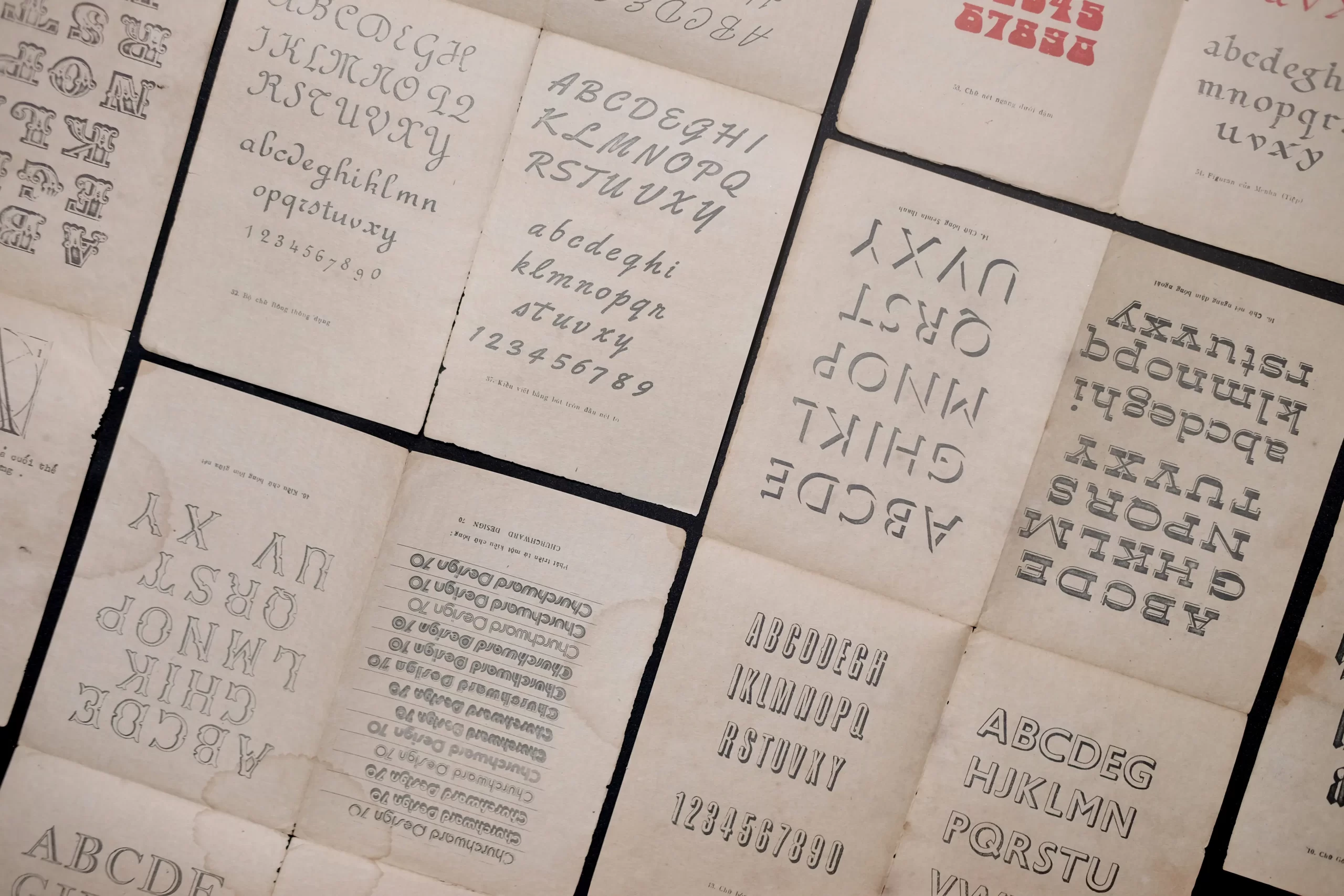
So which of these concepts best describes letterforms in propaganda posters? Considering writing in Vietnamese art from the context of contemporary art in the 1990s, Pamela N. Corey argues that the golden age of propaganda posters reinforced a divide between the graphic arts and the academic domains of fine art. The posters’ written messages belonged to their graphic dimension, tied to mass communication and reproducibility. Corey also introduces the concept of “the calligraphic” to describe the trace of the body, the movement of the hand and individual expression within the act of writing.¹
Le Quoc Huy, a member of the typography collective Luu Chu, suggests that propaganda posters can be regarded as a precursor to the applied arts. At a time when levels of literacy among the public varied widely, images carried the narrative, while lettering was expected to be large, bold and clear, with little punctuation, concise wording and forms that were easy to recognise. Although executed by hand, the lettering still had to serve the purposes of propaganda and broad circulation rather than prioritising the individual style of the artist.²
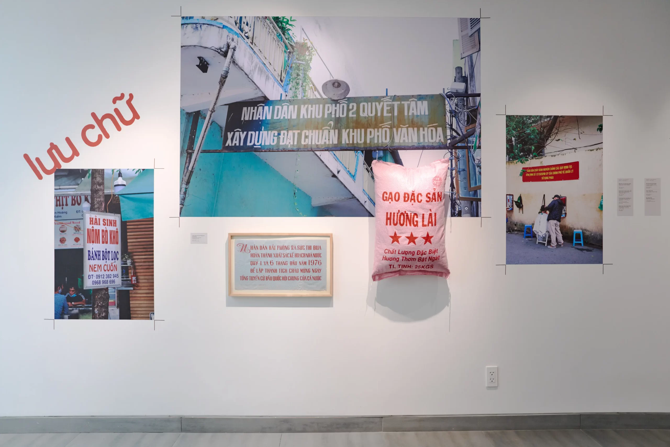
On this basis, the author proposes viewing the textual design of propaganda posters as a lettering practice operating within a typographic framework – it mirrors lettering in the act of constructing and drawing each letterform, yet performs typography’s functions of distributing information and enabling mass production. Although propaganda-poster lettering is not truly calligraphic, the small variations in stroke, proportion and rhythm from one execution to another still preserve traces of the maker’s hand, evoking the calligraphic quality described by Corey.
How, then, could a hand-drawn model pass through many hands while retaining a recognisable unity?
THE REFERENCE GRID
In 1968, the Central Propaganda Poster Workshop of the Central Fine Arts Company was established in Hanoi, marking a shift towards more centralised production of propaganda posters. In 1971, the Screen-Printing Workshop was established with technical guidance from Cuban artists, allowing posters to be reproduced more rapidly and in greater numbers. Before screen printing became widespread, production relied on a collaborative network of artists, woodblock carvers, lithographers and others who were collectively responsible for bringing the work to life.³ ⁴
A preliminary design was rarely carried through from beginning to end by a single person. Artists typically established the initial image, colours and composition before transferring the design to other collaborators, who might add textual content, construct the lettering or complete individual areas of the image. The finished poster was therefore the result of successive handovers rather than the unmediated vision of a single author.
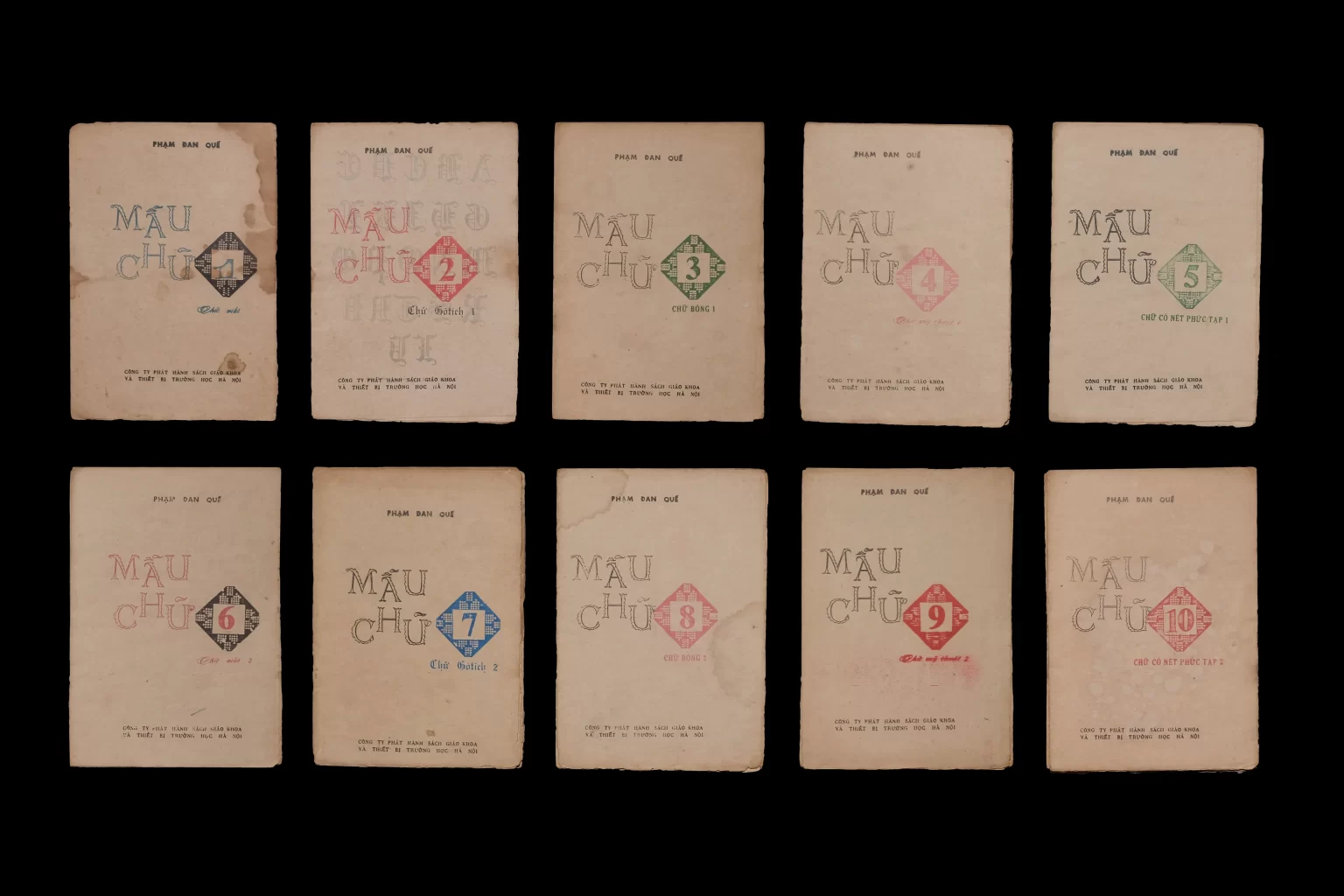
Each letterer had a personal letterform repertoire drawn from compilations such as “100 Model Letterforms”, “300 Model Letterforms” or “800 Model Letterforms”. For each poster, the letterer selected a suitable model and reconstructed every character as a decorative motif, adjusting its width, slant and weight to the available area, the tools at hand and the practical limits of execution.⁵
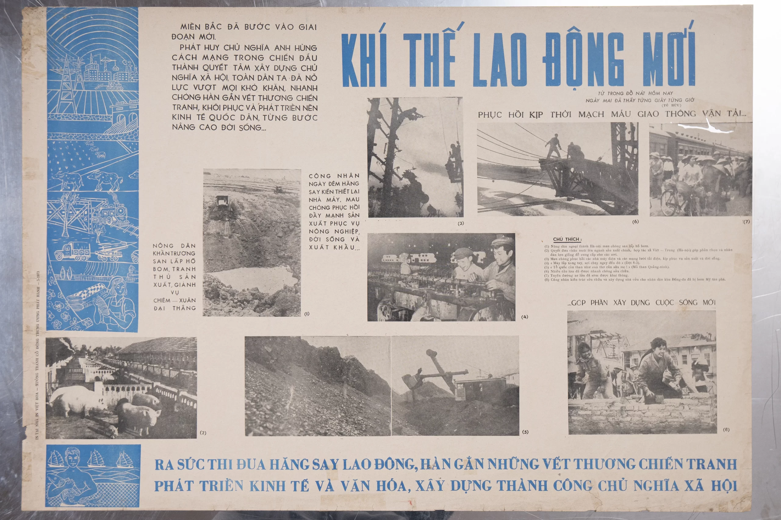
While screen printing made reproduction faster and more consistent, it did not eliminate manual work. Image, colour and lettering still had to be constructed on the master copy before transferring them to print. Each technique also shaped the resulting forms: woodcut tended to produce harder, more simplified lines, while screen printing imposed different constraints on areas of colour and fine detail. With each repetition, the model remained recognisable yet shifted almost imperceptibly according to the maker’s skill, tools and habits. From this production chain, a familiar lettering aesthetic gradually emerged: the chan phuong (modest) letterform.
THE MODEST STROKE
Chan phuong (modest) is not an official category in international typography. In Vietnamese art and design, the term commonly describes lettering that is orderly, clear and balanced, emphasising legibility and structural stability rather than the defining features of any one type family. It is often associated with the bâton letterform, a French-derived term meaning “stick”, referring to robust, relatively even-stroked sans-serif lettering.. The two concepts are not identical, however: bâton names a letter structure, while chan phuong refers more to a visual quality that can appear in both serif and sans-serif lettering.
In propaganda posters, this quality arose from a dual necessity: text had to be instantly legible and seamlessly integrated into the composition. Large, solid and compact lines of text could carry as much visual weight as a figure or symbol. Yet, even as the lettering strove for consistency, it was in effect constructed by different hands, with different tools and under different production conditions. The two works discussed below, originating from two different eras, show how the same chan phuong aesthetic could be put to distinct uses.
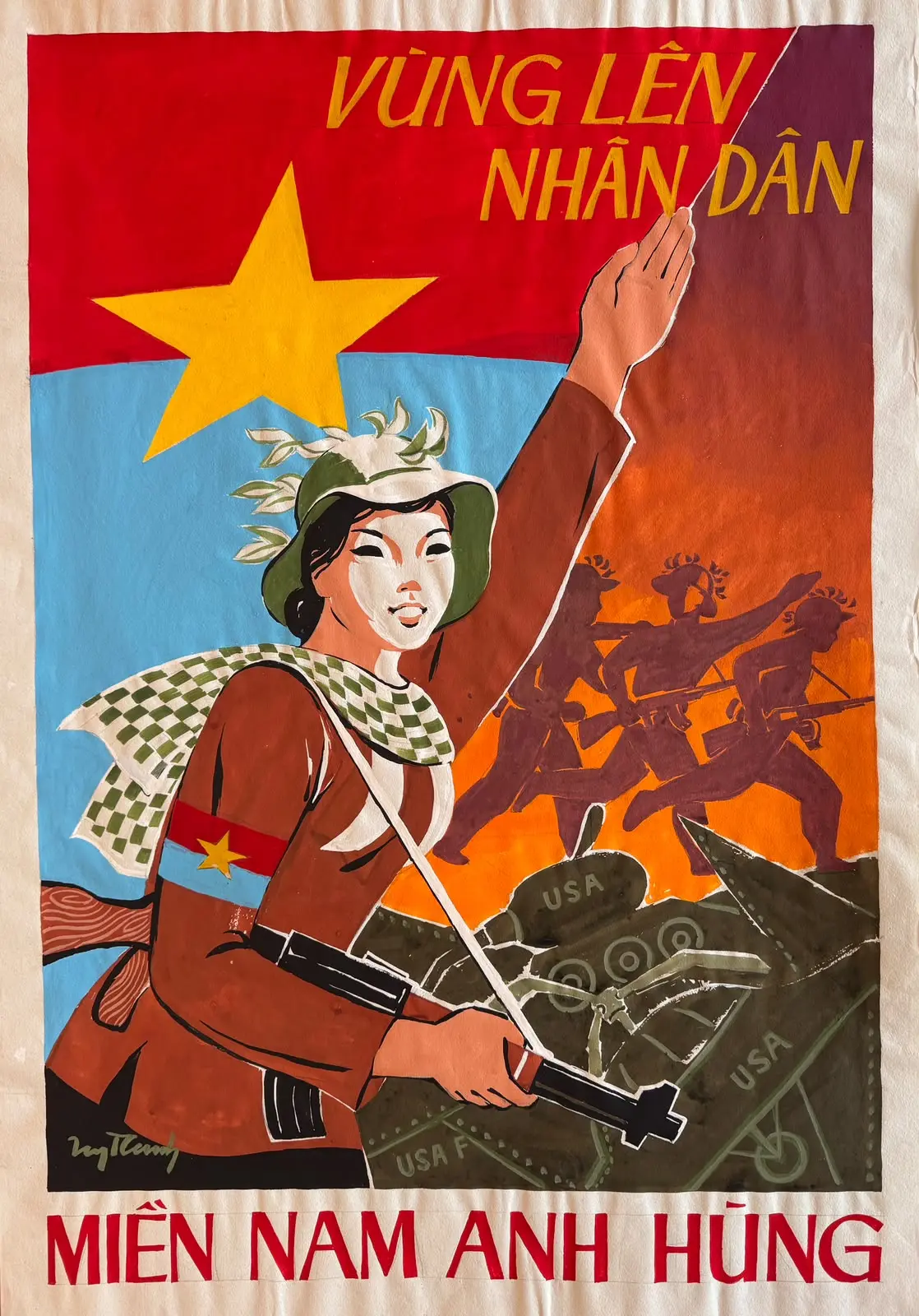
The Heroic People of the South is a representative propaganda poster from the resistance war against the United States, reflecting a spirit of struggle and patriotism. Its upward-driving composition centres on a female guerrilla, with the Liberation flag and elements of the battlefield creating a sense of resolve and defiance. The words “MIEN NAM ANH HUNG (HEROIC SOUTH))” are set in bold red sans-serif capitals against a white ground, making the slogan prominent and legible from a distance. The phrase “NHAN DAN (THE PEOPLE)” follows the direction of the raised arm thrust forwards, leading the eye from the female guerrilla to the message of the people’s strength. The lettering thus not only captions the image, but also participates directly in the movement of the composition.
At this stage, propaganda posters were still largely constructed and copied by hand under material constraints, while also having to meet the demand for rapid propaganda production. That manual trace is particularly visible in the two circumflexes in “NHAN DAN (THE PEOPLE)”, whose shapes are not quite identical. Variations in stroke and proportion do not diminish the clarity of the message; instead, they reveal that the maker’s priority lay in legibility and propagandistic effectiveness. Those minute discrepancies also preserve the trace of an individual hand within a composition designed for uniformity.
The poster Plant More Corn, by Minh Phuong, was created in the context of northern Vietnam’s intensified drive to build socialism, when propaganda posters increasingly addressed labour emulation campaigns, increased production and agricultural development. Compared with the tension of wartime posters, its composition is more balanced and stable. The central figure is surrounded by maize stalks forming a steady rhythm, suggesting abundance and calm.
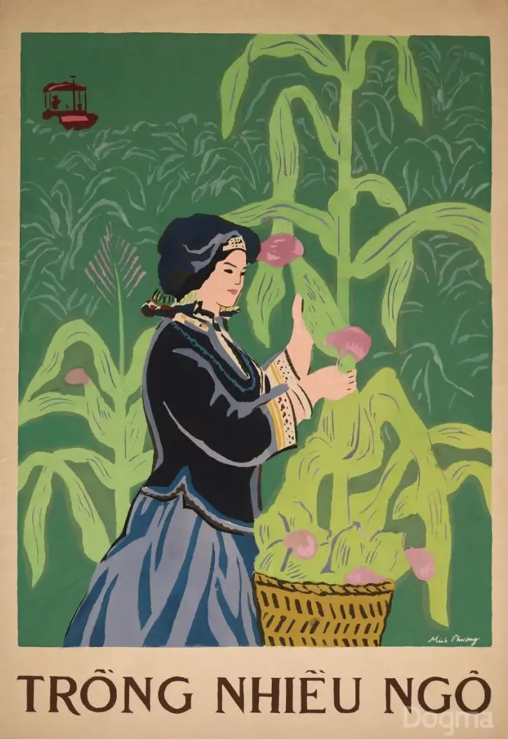
Advances in printing allowed the image and lettering to be reproduced with greater consistency and sharpness. The line “TRỒNG NHIỀU NGÔ (PLANT MORE CORN)” uses serif capitals; the spacing, proportions and weight of the characters are controlled with relative consistency. The two circumflexes over Ô are also closer in shape, unlike the more obvious variations in Heroic People of South Vietnam. Together with the green, yellow and blue palette and the flat areas of colour, the lettering contributes to the work’s buoyant, optimistic and approachable mood, characteristic of a period oriented towards production and reconstruction.
Seen side by side, the two works show that chan phuong is not confined to a single type family. What connects them is structural solidity, clear legibility and the close integration of lettering with image. It is precisely this passage from hand to print that produced a visual legacy for designers today to continue reading anew.
TURNING THE PAGE
Many young Vietnamese designers have actively researched and renewed this typographic inheritance through archival and design projects. Among the notable initiatives is Luu Chu, a typography collective which collects, digitises and develops Vietnamese type – theircollaboration with Dogma Collection, the exhibition Collection+, was devoted to graphic works and grounded in sustained research into propaganda posters and lettering. Another notable intiative was Behalf Studio’s exhibition Republish: Typography As…, which draws on vernacular typographic values before digitising letterforms for further application. These practices not only preserve a design legacy inherited from propaganda posters, but also affirm Vietnamese typography as a creative field rich in contemporary potential.
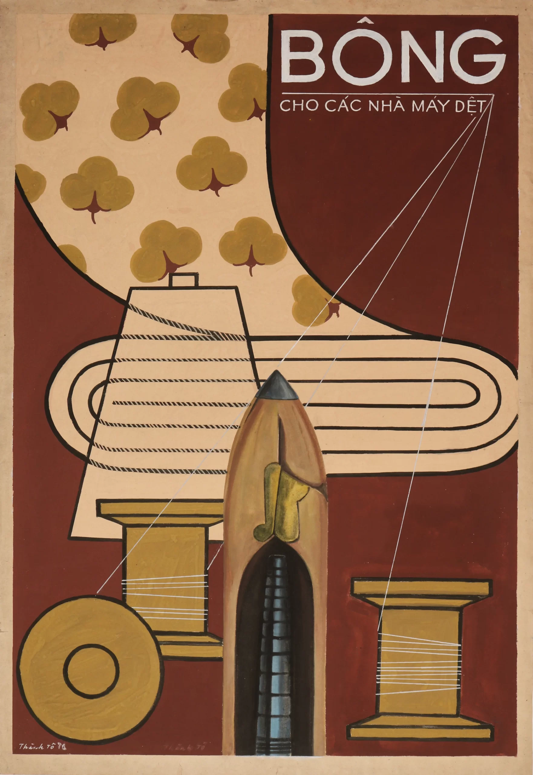
Lettering in propaganda posters is much like the O of that first primer lesson: a small element that opens onto much more. Just as O becomes “Ô when it wears a hat, and Ơ when it grows a whisker”, a new generation today continues to read, retrace and digitise the chan phuong letterforms of propaganda posters for contemporary design. That circle, like the O on the page, is still being drawn.
We’d like to extend our sincere thanks to Minh Nguyen and Nguyen Ngoc Lien from Dogma Collection, as well as Quoc Huy from Luu Chu, for their invaluable insights, materials, and support throughout the writing of this article.
Words: Nguyễn Hoàng Gia Bảo & Cao Quốc Huy
Translation: Art Nation
[1] Pamela N. Corey, “The (Calli)graphic Regimes of Contemporary Vietnamese Art”, ARTMargins, Vol. 13, No. 3 (2024), pp. 13–35.
[2] A conversation between Nguyen Hoang Gia Bao and Cao Quoc Huy with Minh Nguyen and Nguyen Ngoc Lien (Dogma Collection), and Quoc Huy (Luu Chu), July 2026.
[3] Vi Kien Thanh, “A Brief History of Vietnamese Propaganda Posters,” the Ho Chi Minh Museum website (2019).
[4] Huyen Nga, “Artist Thuc Phi: Propaganda posters – there was once such a time,” Nhan Dan (2017).
[5] Luu Chu, “Cultural archive, research & contemporary design practice,” presentation at the Dogma Collection (2025).