Đọc phiên bản tiếng Việt tại đây.
If the life of a national language is imagined as water taking the shape of its era, then through the lens of graphic design, speech ceases to be invisible once it materialises as writing. Letterforms, inked strokes and compositional structures are material entities in their own right, carrying the aesthetic ideologies and social order of their time. Between 1865 and 1945, Vietnam underwent a transformation in both script and printing technology. The advent of the press and Western letterpress printing shifted the page from the dominance of the vertical Sino-Nom compositional axis to the horizontal reading grid of Latin script. In this process, the letterform itself became a structural element of image-making. The shift from brush to lead type sparked a cultural dialogue: local artists and artisans embraced the utility of imported technology while exercising visual autonomy beyond older artistic conventions, preserving the planar image-making and allusive visual logic at the core of the Vietnamese aesthetic tradition. Drawing on cultural-interaction theory, this study defines “Editorial graphic design” as the systematic organisation, across the printed page, of typography, illustration, decorative motifs and the orchestration of white space to produce an integrated communicative whole with an identity of its own.
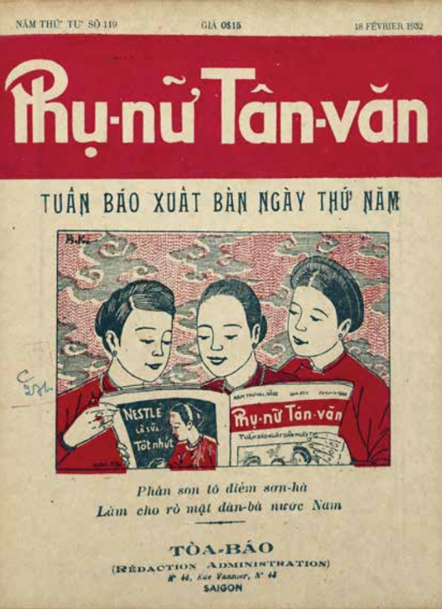
The collision of visual structures in the early period (1865–1915)
For centuries before the arrival of Western printing presses, Vietnamese cultural and intellectual life operated within the aesthetic sphere of Chinese characters and the woodblock-carving traditions of Hong Luc and Lieu Chang (Hai Duong).¹ Monolithic and manual, woodblock printing imposed a strict visual order: each character occupied an imagined square module, arranged vertically from top to bottom, with the columns proceeding from right to left, creating a slow, contemplative rhythm of reading. The old book page appeared as a planar whole, its edges naturally softened and blurred through loofah rubbing on giay ban (traditional Vietnamese bast-fibre paper).²
This aesthetic order began to change as Western knowledge flowed into the country in the late 19ᵗʰ century. Quoc ngu, the romanised Vietnamese script, was composed from separate Latin-script sorts and compatible with lead-type letterpress machinery in Saigon from 1861 onwards.³ Individually cast pieces of lead type broke apart the integral surface of the carved woodblock and introduced a “grid” that divided the page into vertical columns.⁴ Serif typefaces in the Didot or Garamond families imposed a new visual rhythm, sharp-edged and mechanical. The redirection of the eye from vertical to horizontal was, in the author’s terms, a process of visual “de-Sinicisation”, through which the Vietnamese press gradually moved beyond inherited Chinese cultural structures to develop an independent modern mode of thought.
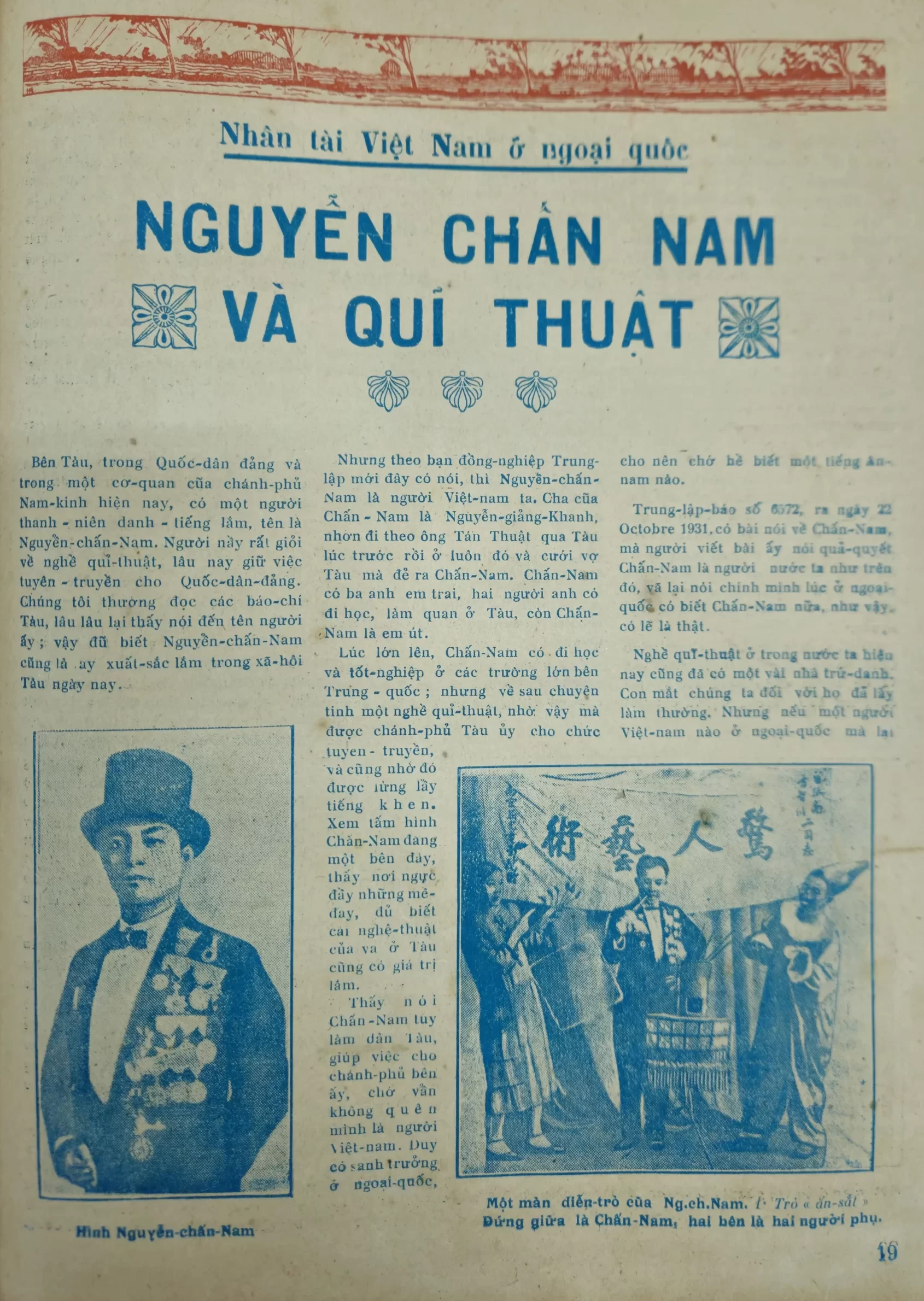
Yet early publications retained traces of this compelling “mechanical collision”. A paradigmatic example appears in the newspaper nameplate of Gia Đinh Bao (Gia Dinh Newspaper) (1866), where the three Chinese characters “嘉定報” were set horizontally from left to right, in alignment with the line of Quoc ngu directly beneath them.⁵ Under traditional convention, Chinese was written vertically from top to bottom, with columns running from right to left; even a single horizontal line was read from right to left. The reversed, left-to-right sequence of the three characters on the page was therefore not an orthographic error. It was a technical accommodation devised by printers to establish parallel alignment and visual balance across the page. Readers were compelled to reverse their established habit, producing a palpable visual incompatibility. This is an exemplary conflict between the reading directions of two scripts, vividly documenting the early Europeanisation of Vietnamese print graphics during a period of transition.
This fragmentation continued in Thong Loai Khoa Trinh (A Miscellany of Instructive Readings) (1889). Its Chinese title, 通類課程, was set horizontally at the topmost level and read from right to left, while the author’s name, 張永記 (Truong Vinh Ky), and the sexagenary-cyclical year 己丑 (Ky Suu) were arranged on the traditional vertical axis at the centre. This vertical block operated as a rational axis of symmetry, marking a boundary and disciplining the horizontal clusters of type around it.
The “collision” was also inscribed in the graphic microstructure of the page. Early lead-type composition could not yet accommodate the Vietnamese system of five tone marks, so printers had to cast the marks as separate sorts and manually position them above or below the base letter. The uneven rise and fall of those marks across late-19ᵗʰ century Quoc ngu newspapers is a material record of the mechanical dialogue between a local print language and still-rudimentary Western machinery.
Aesthetic acculturation and formal agency (1915–1945)
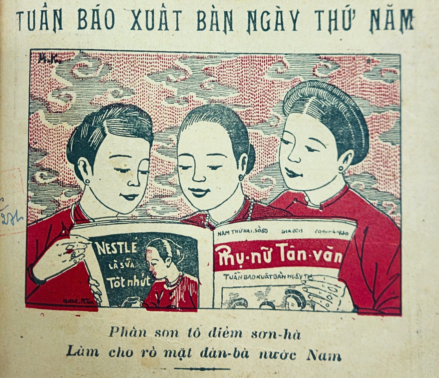
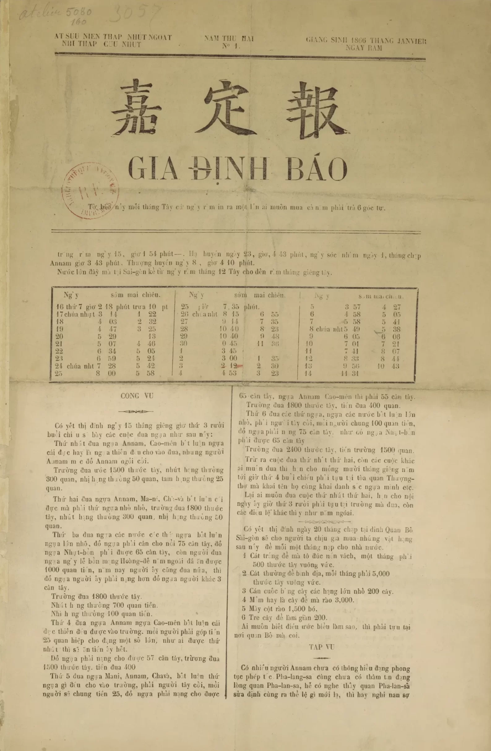
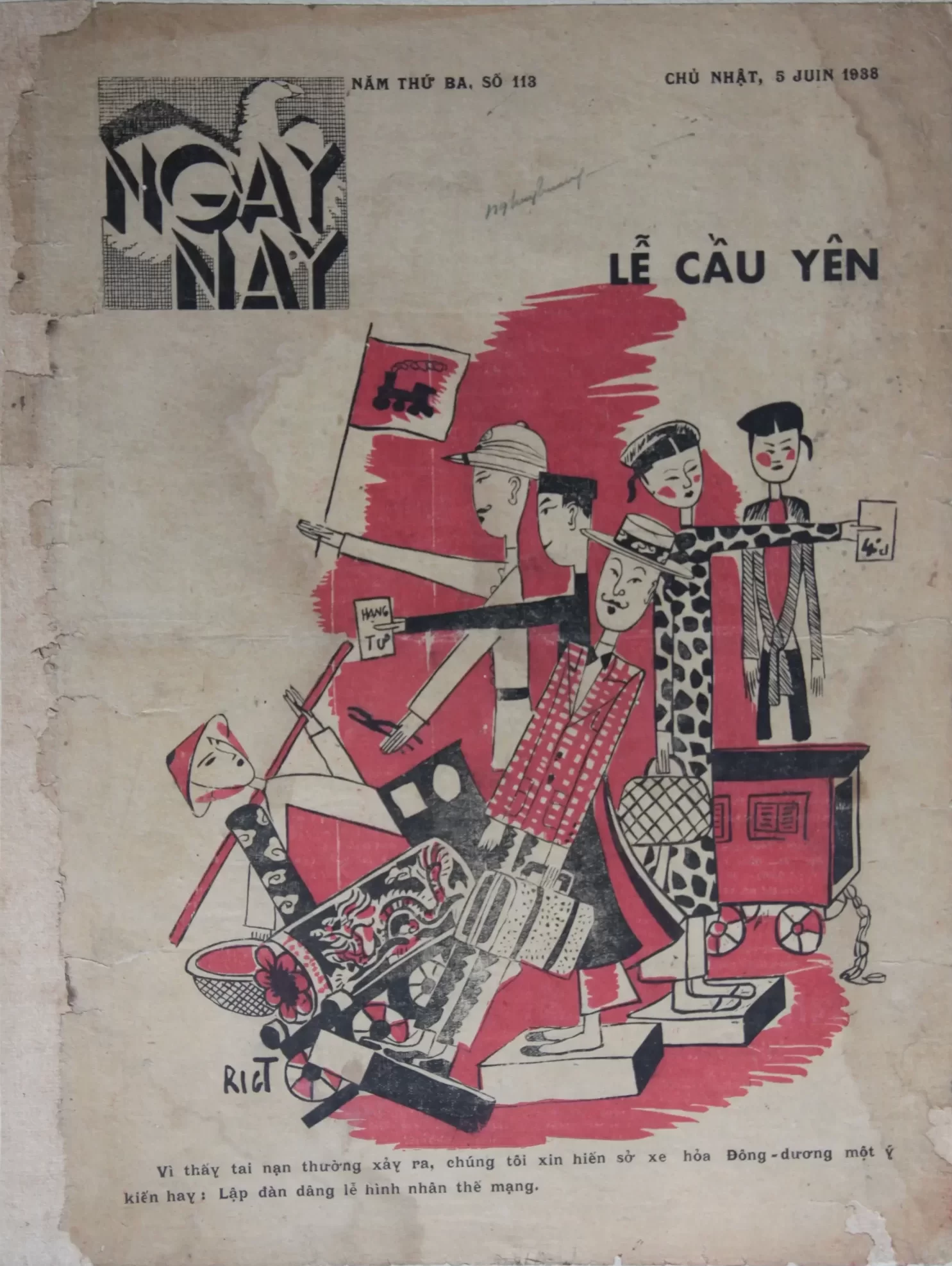
Following the establishment in 1925 of the Indochina School of Fine Arts, press graphics entered a phase of deliberate aesthetic acculturation. A generation of academically trained artists, including Nguyen Gia Tri, To Ngoc Van and Le Yen, fused two paradigms, taking Western technique as the means and East Asian formal identity as the point of reference.⁶ A clear division of labour emerged across the printed page: compositors set the text in lead type, whereas artists asserted their mark through freely drawn hand lettering in newspaper nameplates and headlines. The shift becomes especially visible when the Tu linh (the Four Sacred Creatures) ornament surrounding the vertical Chinese-character axis of Dai Nam Dong Van Nhat Bao (The Dai Nam Common-Script Daily) is set against the nameplate of the 1936 Lunar New Year issue of Ngay Nay (Today), designed by Nguyen Gia Tri.⁷ On the cover of Ngay Nay, the artist turned to a forceful geometric Art Deco, breaking with the older curvilinear manner of lettering. The Latin letterforms shed their interlocking calligraphic flourishes in favour of thick, squared vertical strokes, establishing a modern structure of visual balance. By 1930, this shift was being realised through zinc line-block etching, which produced raised lettering on zinc relief plates that could be locked up alongside lead type.⁸ At the same time, the Western horizontal reading grid was deftly adapted to the conventionalised, allusive spatial logic of an East-West ornamental synthesis.⁹
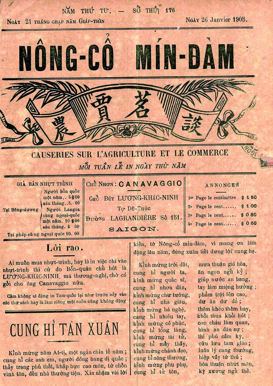
In Nong Co Min Dam (Tea Talks on Agriculture and Commerce) (1902), the four Chinese characters “農賈茗談” were released from the rigidity of lead type through a zinc relief plate, nesting fluidly within a Western Baroque ribbon beside a local rice-sprig motif.¹⁰ This aesthetic symbiosis reached maturity on the Lunar New Year cover of the Catholic weekly Nam Ky Dia Phan (The Diocese of Cochinchina) (1938). Although it was a Catholic publication, the entire border employed key-fret motifs and seal-script corner fretwork recalling the ensemble structure of horizontal inscribed plaque flanked by paired vertical couplets rooted in traditional architectural vernacular. At the visual centre, a yin-yang taiji emblem sat between two symmetrical plum blossoms, enclosing the Quoc ngu text that says “Welcome Spring”.
In literary sections such as “Van Uyen (The Garden of Literature)” and “Gia Chanh (Domestic Arts)”, courtly symmetrical composition was reconstituted within a modern letterpress system. Flat fields of illustration, fine linear drawing and the expansive empty ground recalling ink-wash painting produced a harmonious graphic structure. The newspaper page achieved a clear state of aesthetic symbiosis: it maintained the rational clarity of Western technique while preserving the character of traditional culture.
The exchange of connotative value and lessons for contemporary design
Within traditional art, the Sino-Nom script was not simply a tool for recording semantic content; it bore the connotative value of an ideological system.¹¹ In a vertical composition, the viewer did not merely read but contemplate the shapes of the characters in relation to the surrounding void. From a semiotic perspective, the move to the horizontal disposition of Latin script on the colonial newspaper page transformed the prevailing discourse, establishing the pragmatism, speed and fragmentation of urban society.¹² Latin characters initially carried no intrinsic pictorial value, functioning solely as phonetic notation along a horizontal axis. Cultural interaction occurred, however, when artists reversed the exchange: they turned Latin script from an entity to be “read” into one to be “seen”, embedding it within the aesthetic value system of the traditional square character.
The trace of classical traditions in contemporary design therefore lies not in repeating ancient characters, but in the orchestration of values between word and image. When designers develop a minimalist poster or book cover, allowing a broad expanse of empty ground to dominate the plane while concentrating Latin type along a vertical axis or within a symmetrical corner, they are effectively organising the page through a calligraphic lens: treating white space as khi (air), inseparable from the text itself.¹³
The interplay between Quoc ngu and early 20ᵗʰ century planar graphics offers an incisive academic lens for design thinking and practice-based research. Educational reform should seek to decode inherited aesthetic codes and reintegrate them into new digital creative platforms. The legacy of Quoc ngu press graphics in colonial Vietnam demonstrates that design becomes truly transformative only when the most advanced means of its time are enlisted to articulate the national narrative with an unmistakable spirit and bearing of its own.
(This research was supported by The VNUHCM-University of Information Technology’s Scientific Research Support Fund).
Words: Nguyễn Hồng Ngọc
Translation: Art Nation
[1] Tang Ba Hoanh, Traditional Crafts of Hai Hung, Volume I, Hai Hung Provincial Party History Research Committee (1994), pp. 72–76.
[2] Phan Cam Thuong, Cung Khac Luoc, Le Quoc Viet, The Ancient Graphic Arts of Vietnam, Fine Arts Publishing House (2001), pp. 45–52.
[3] Nguyen Hai Chi, “A History of Printing in Vietnam”, History and Geography Review, no. 22 (1971), pp. 115–120.
[4] Nguyen Van Hiep, “Printing Technology and the Modernisation of the Quoc ngu Press in the Early Twentieth Century”, Journal of Social Sciences and Humanities, no. 66.4, University of Social Sciences and Humanities, Vietnam National University, Hanoi (2020), pp. 34–49.
[5] Huynh Van Tong, The Vietnamese Press from Its Beginnings to 1945, Ho Chi Minh City General Publishing House (2016), pp. 19–24.
[6] Quang Phong and Tran Thuc, Fine Arts in the Capital in the Twentieth Century, Fine Arts Publishing House (1997), pp. 32–38.
[7] Nguyen Tuong Tam (Nhat Linh), “The Significance of Phong Hoa and Ngay Nay for Modern Art”, Ngay Nay, Special Issue (1936), pp. 5–8.
[8] Nguyen Van Hiep (2020).
[9] Phan Cam Thuong, Cung Khac Luoc, Le Quoc Viet (2001).
[10] Huynh Van Tong (2016).
[11] Phan Cam Thuong, Cung Khac Luoc, Le Quoc Viet (2001).
[12] Huynh Van Tong (2016).
[13] Phan Cam Thuong, Vietnamese People’s Material Civilisation, Tri Thuc Publishing House (2012), pp. 112–115.